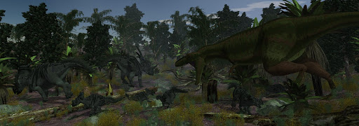
I was able to litter the forest floor with more "stuff". I like it, but I'm going to need more. Have to fidget with some smaller stuff (dead leaves and branches) to capture the true feeling of a forest.
I also added a thin fog to the forest to help decamouflage my Gorgosaurus (man I can't get over how good that cameo is... unfortunately it is too good in this case :P). Hat tip to Matt and David for pointing me in the mist/fog direction. It'll need some adjustment and tweaking, but I think for a first pass this looks not too bad!
I dare say beyond the forest litter needed, I might have something ready for a proper lighting experiment now. What do you all think?

4 comments:
Hi Craig, I did a quick speedpaint over your render to point out some of the issues that I feel need to be addressed. Generally, I recommend leaving 3D regularly and doing such paints, because 3D tends to dictate solutions via the technical opportunities at hand...
Other than pushing the tonal range, I only really worked over the attacking Gorg... main issues: lighting in accordance with the shadows, but so that his volume is sculpted. Important... the deep shadow plants him spatially, a right rim (likely too bright) picks up the fresnel / specularity. Note, a good deal more of the blue form the sky is in the surrounding skin color.
Compositionally, I used dust (sic) to form some negative space behind the GOrg to make sure he reads. Problem with our technique is sculpting such compositional spaces.
Once you know what the goal is and have tested your ideas with paints, then you can light much more quickly because you're not tweaking minor things before getting the big picture laid out. Let me know if this is helpful.
oops...
http://www.drip.de/?p=1661
What he said.. and painted.
cool! looking better!
Post a Comment