Okay though still in rough form, I'm ready for some hard feedback on the new lighting scheme.
I have added my first ever secondary sky lights, proper bounce light, and rim lighting to all the following Dinosaurs.
The environment (the water in particular) needs some more work. So this is just the Dinosaurs and their effective lighting byproducts (though I am aware there needs to be a shadow on the water).
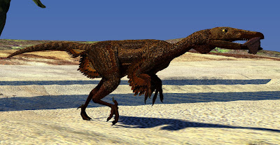
The
Troodon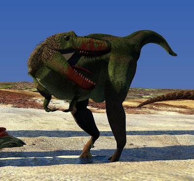
Chasing
Gorgosaurus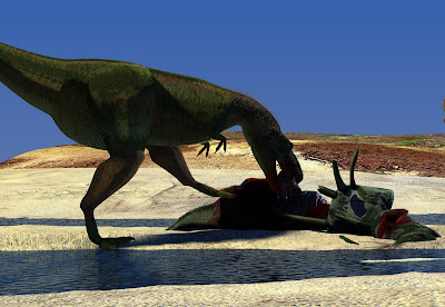
Feeding
Gorgosaurus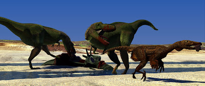
The
rough layout of the final will be this (though I'm thinking about playing with field of depth on the camera later)
Thoughts? Feedback?
Matt and David in particular feel free to let the honesty flow. I'm new at this, and don't want to get in bad habits right out of the gate.
 The Troodon


2 comments:
Very brief, no time for paintovers today...
Starting to get details in the shadows. Push that farther and then push it farther.
- the sun is very low, as judged from the shadows. Either sunset or sunrise. Round about the magic hour.
- The shadows have a very harsh transition border. (ie. from lit surface to shadow is a fairly narrow band, as opposed to a long gradient)
- the two above points don't occur together. The light contrast between direct and bounced light is much lower at the magic hour... so the eye can take in details of both shadow and sunlit surface.
Generally, illustrative techniques focus more on getting the details in across wide ranges... it's a stylistic decision, but I feel you'd profit lots by trying it out. Get some details in your shadows, and - if your sun is as low as it is here - some softness in the transition.
My 2 cents. Off to stoopid wurk wurk.
I can't add much to what David has said.
I do think you'd benefit from adding a greater range of values to the colours of your dinosaurs. The Tyrannosaurs in particular.
If I squint at the image the tyrannosaurs become a single cut out of value.
The browns and greens all share the same value, making it hard for the eye make out differences in the topography of the animal.
Not the lighting, but surfacing and lighting have to come together to create the picture!
Post a Comment