As I discovered this week when trying to show many of the palaeontologists at the
Tyrrell Museum my portfolio, I should look into cleaning this up to best show my
capabilities while not showing off less professional pieces. I'm looking for your help. Can you tell which of the follow should or more to the point not be in my portfolio. Just use the criteria if you were making a prehistoric critters book or press release, which of these would you use or consider good enough to be published. To encourage you to be as honest (and brutal as you want) I'm giving you my own break down of these pieces.

1. I think I should include. While the water environment is
sparse, otherwise this piece does everything I wanted in
communicating the size of the
Mosasaur compared to a human.
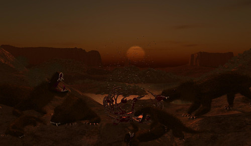
2. I'm not sure. I love the composition, lighting the models are not by best. What would your take on this be
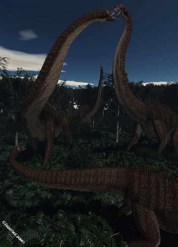
3. No. The Dinosaur models are not high enough quality, especially in the leg area.
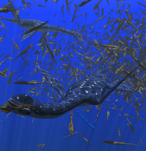
4. Yes. My water scenes are my best, though in this case I'm not fond of the head to neck connection in this piece.
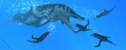
5. Yes. Again water good. Though the Penguins aren't the best thing ever.
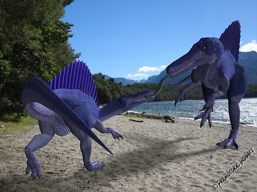
6. No.
The colours are just a bit too much here.
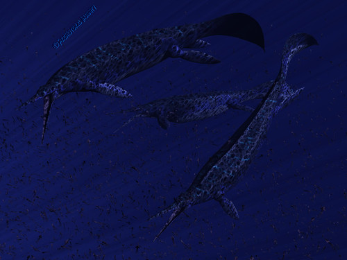
7. No, but I feel this is my weakest water piece. I could be persuaded otherwise.
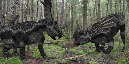
8. Yes, as this is one of my better photo composites, plus these guys are some of my strongest current Dinosaur models.
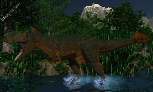
9. Yes as this is the best virtual environment I've ever built. However I'm not fond of the models leg to body connection.
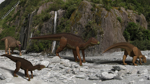
10. No.
These models are not my best, and the photo composite is nothing to write home about.
 11. Yes.
This is in my opinion of my two best pieces ever.
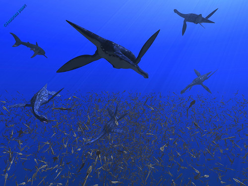
12. Yes, another very very strong water piece.
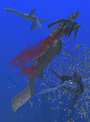
13. Yes.
This would be the other of the two I consider my best. Sadly the
Mosasaur is no longer current. However I still think this piece is incredibly strong (minus the
Pleisosaurs head to neck connection).
14. Yes. This is a very strong photo composite. Though the arm is not fantastic.
15. Yes. This is my strongest current Dinosaur piece.
Though if you could please let me know your thoughts, especially of those that you think don't help show my actual capabilities as an artist. I will not take personal hurt from critiques and tear downs of these pieces.
 1. I think I should include. While the water environment is sparse, otherwise this piece does everything I wanted in communicating the size of the Mosasaur compared to a human.
  2. I'm not sure. I love the composition, lighting the models are not by best. What would your take on this be
  12. Yes, another very very strong water piece.


4 comments:
Not exactly any good at judging art, but from pure intuition I agree with all of your choices here.
I agree with most of your choices, however, imo, #2 is one of your strongest pieces period.
Great atmosphere and lighting. It's dimly lit which can hide anything with the models you may not be happy about (I think they look very convincing, but I'm not sure why you think it's weak really).
Looking again, #14 is phenomenal: I love the unusual pose, it feels like an animal found in the jungle instead of the typical cinematic action shot that dominates paleo-art.
yeah! 14 is the best!
Post a Comment